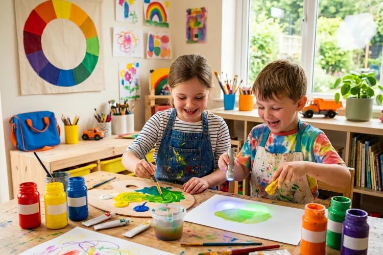
Look around you for a moment. You might see a blue bag, a yellow pencil, a green plant, or an orange toy. The world is full of colour, but have you ever wondered where all those different colours come from?
Many colours can be created by mixing just a few basic ones. These are known as primary colours. When two primary colours are combined, they can produce secondary colours.
It sounds simple, but colour mixing becomes even more interesting when we discover that paint, printers, and glowing screens do not all use the same primary colours.
Understanding primary and secondary colours is useful for painting, drawing, photography, printing, fashion, interior design, and digital art. It can also turn an ordinary art activity into a colourful science experiment.
In this guide, we will explore the traditional colour wheel, learn what happens when pigments and light are mixed, and try some easy activities. Get your brushes ready because colour is about to become much more exciting.
What Are Primary Colours?
Primary colours are the starting colours in a colour system. They are used to create many other hues through mixing.
In the traditional colour wheel taught in many art classes, the primary colours are:
Red, yellow, and blue.
These three are commonly called the RYB colour model. In traditional art theory, they are treated as colours that cannot be created by mixing the other colours in that model.
MoMA defines a primary colour as one that cannot be made by combining other colours, while a secondary colour is produced by combining two primaries.
Think of primary colours as the basic ingredients in a recipe. Flour, eggs, and sugar can be combined to create different cakes. In a similar way, red, yellow, and blue paint can be combined to produce a wider range of colours.
However, this traditional model mainly helps beginners understand artistic colour mixing. Other colour systems use different primary colours depending on whether they work with light, ink, or pigment.
What Are Secondary Colours?
Secondary colours are created when two primary colours are mixed. On the traditional RYB colour wheel, the combinations are:
Red + yellow = orange
Yellow + blue = green
Blue + red = purple or violet
The National Gallery of Art explains that artists make secondary colours by mixing pigments from two primary colours. These secondary hues are placed between their parent colours on the colour wheel.
For example, orange appears between red and yellow because it contains both. Green sits between yellow and blue, while purple is positioned between blue and red.
The exact result can vary. A warm red mixed with a bright yellow may produce a vivid orange, while a darker red and muted yellow may create a brownish shade.
The type of paint, amount of each colour, and strength of the pigment all affect the final mixture.
That is why colour mixing is partly a science and partly an adventure.
How the Colour Wheel Organises Colours
A colour wheel is a circular chart that shows how colours relate to one another. It makes colour combinations easier to understand and helps artists plan their work.
Isaac Newton developed an early circular arrangement of colours after studying how white light separates through a prism. Modern wheels vary, but they generally place related hues next to one another.
On a traditional wheel, the three primary colours are spaced apart. A secondary colour appears between each pair:
- Orange sits between red and yellow.
- Green sits between yellow and blue.
- Purple sits between blue and red.
Colours next to each other, such as blue and green, are called analogous colours. They often create a smooth and harmonious combination.
Colours opposite each other are known as complementary colours. Red and green, blue and orange, and yellow and purple are traditional complementary pairs.
When placed side by side, they can create strong contrast and make each other appear more noticeable.
Mixing Paint Is Different from Mixing Light
Here is where colour theory becomes surprising: primary colours can change depending on what is being mixed.
Paint works by absorbing some wavelengths of light and reflecting others. As more pigments are mixed, more light is absorbed, so the result generally becomes darker or duller. This process is known as subtractive colour mixing.
Screens work differently. Televisions, phones, tablets, and computers produce colours by combining light. Their primary colours are:
Red, green, and blue, usually shortened to RGB.
When coloured lights overlap, the results are:
- Red light + green light = yellow light
- Green light + blue light = cyan light
- Blue light + red light = magenta light
- Red + green + blue light = white light
This is called additive colour mixing because adding more coloured light moves the result closer to white.
NASA explains that computers process colour through red, green, and blue values, while most visible colours on digital displays can be created by combining these channels.
So, mixing blue and yellow paint may create green, but overlapping blue and yellow light does not follow the same rule. The material being mixed matters.
Why Printers Use Cyan, Magenta, and Yellow
Home and commercial printers use another system called CMYK. The letters stand for cyan, magenta, yellow, and black.
Cyan, magenta, and yellow function as subtractive primary colours in modern printing. They absorb different parts of white light:
- Cyan and yellow produce green.
- Yellow and magenta produce red.
- Magenta and cyan produce blue.
In theory, combining all three should create black. Real printing inks usually produce a muddy dark colour instead, so printers add a separate black ink. The letter K represents the black or key plate.
Traditional red, yellow, and blue remain useful for introducing children to colour mixing, but cyan, magenta, and yellow can create a broader and more accurate range of printed hues.
Adobe distinguishes between the RYB model used in traditional art, RGB for screens, and CMYK for printed work.
This explains why an artwork may look slightly different on a laptop screen and on a printed page. The two formats create colour in different ways.
How Tertiary Colours Expand the Colour Wheel
Primary and secondary colours are only the beginning. When a primary colour is mixed with a neighbouring secondary colour, the result is often called a tertiary or intermediate colour.
The traditional tertiary colours include:
- Red-orange
- Yellow-orange
- Yellow-green
- Blue-green
- Blue-purple
- Red-purple
Suppose you mix red and yellow to make orange. Adding more red creates red-orange, while adding more yellow creates yellow-orange.
The amount of each ingredient changes the result. A mixture containing equal quantities may sit near the middle, while a mixture with much more blue than yellow may become a deep blue-green.
Artists can create even more variations by adding white, black, or grey. Adding white produces a tint, adding black creates a shade, and adding grey or a complementary colour can create a softer tone.
With these techniques, a small paint set can produce hundreds of unique results.
Warm and Cool Colours Create Different Feelings
Colour wheels are often divided into warm and cool groups.
Warm colours usually include red, orange, and yellow. They may remind us of sunlight, fire, autumn leaves, or warmth. In an artwork, they can feel energetic, cheerful, exciting, or intense.
Cool colours usually include blue, green, and purple. They may suggest water, shadows, plants, ice, or the evening sky. These hues can feel calm, distant, peaceful, or mysterious.
These emotional associations are not strict rules. A bright turquoise can feel energetic, while a dark red may feel serious rather than cheerful. Meaning can also depend on culture, personal experience, and the other colours surrounding it.
Still, understanding warm and cool colours helps artists make thoughtful decisions. A warm orange subject against a cool blue background, for example, creates both visual contrast and a strong sense of focus.
Try a Simple Colour-Mixing Experiment
The easiest way to understand primary and secondary colours is to mix them yourself.
Prepare red, yellow, and blue washable paint, a brush, water, and a sheet of white paper. Ask an adult to help protect the table and clothing before starting.
First, paint three separate circles using the primary colours. Next, create three empty spaces for the secondary mixtures.
Combine equal amounts of red and yellow. Record the orange you create. Clean the brush, then combine yellow and blue to make green. Finally, mix blue and red to produce purple.
After the basic experiment, change the ratios. Try two parts yellow with one part blue, then two parts blue with one part yellow. Compare the two greens.
Write down what changed. Which green looks warmer? Which one seems darker? Did every mixture match your prediction?
Open-ended colour exploration allows children to observe, experiment, change their plans, and discover unexpected results. NAEYC recommends giving children room to direct their own art experiences instead of focusing only on producing one perfect result.
Common Colour-Mixing Problems
Sometimes red and blue paint create brown instead of a bright purple. Yellow and blue may also produce a dull green. This does not necessarily mean you mixed them incorrectly.
Commercial paints often contain pigments that lean towards neighbouring colours. A warm red may contain an orange bias, while another red may lean towards purple. Mixing pigments with different biases can produce muted results.
Too many colours can also create mud. When all three traditional primaries are combined, they absorb a wide range of light and often form brown, grey, or a very dark neutral.
Dirty brushes and cloudy water can accidentally add unwanted pigment. Cleaning the brush between mixtures usually produces clearer results.
Begin with small amounts of paint and add more gradually. It is much easier to darken or change a mixture than to remove a colour after too much has been added.
Most importantly, do not treat an unexpected shade as a failure. Give it a name, record the recipe, and consider where it could be used in an artwork.
Primary and secondary colours provide a simple foundation for understanding how colour works. In traditional painting, red, yellow, and blue act as primary colours, while orange, green, and purple are their secondary mixtures.
The rules change when we work with other media. Screens combine red, green, and blue light, while printers rely mainly on cyan, magenta, yellow, and black ink. Knowing the difference makes colour theory more accurate and interesting.
The best way to learn is through experimentation. Gather three washable paints, create your own colour wheel, and test how different ratios change each mixture.
Do not worry about achieving one perfect result. Every new shade is evidence of what happens when colour, creativity, and curiosity meet.